Responsive Images: A Complete Implementation Guide
Alex Johnson
Web Performance Expert
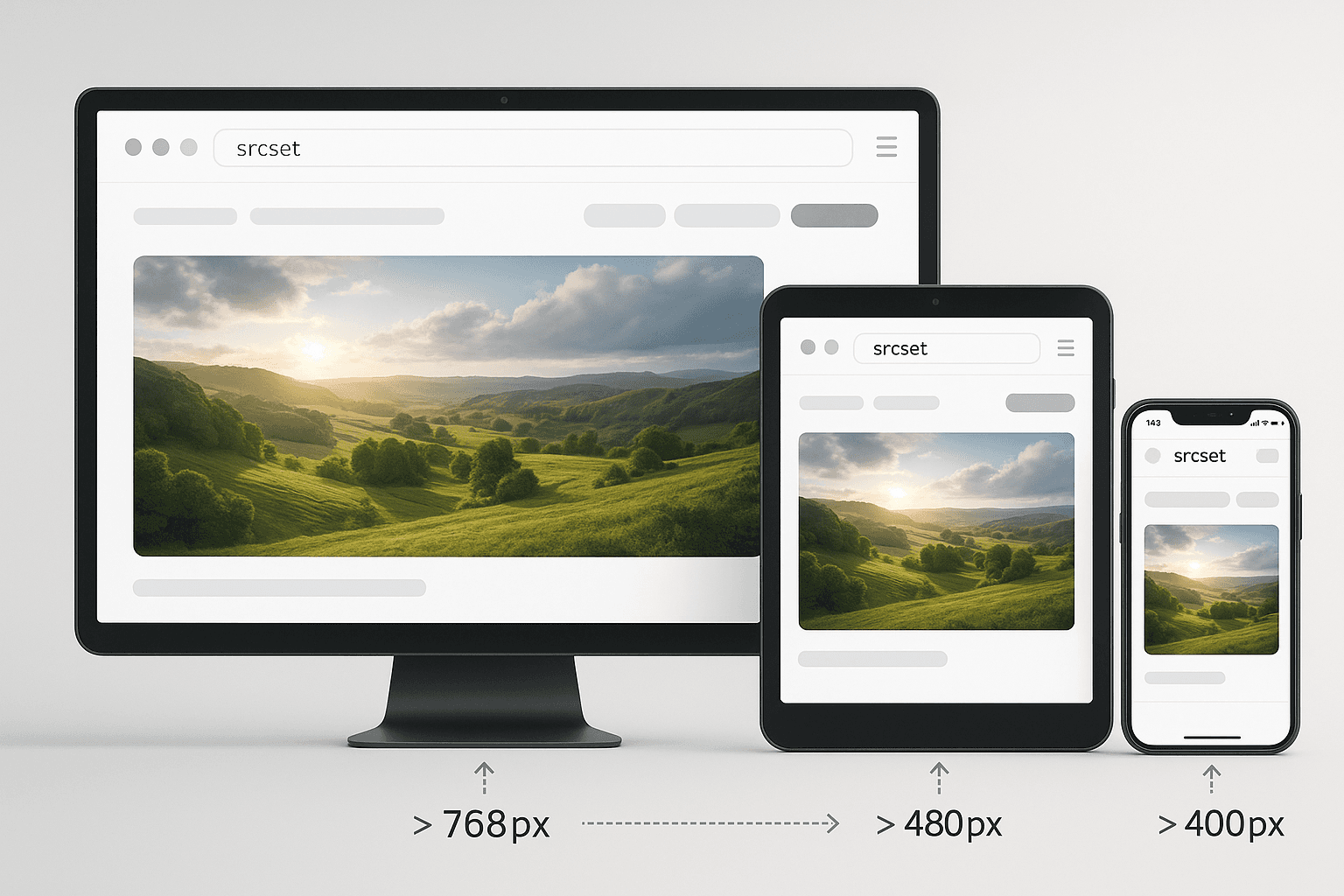
In 2025, your website visitors use devices ranging from 320px smartphones to 5K displays. Serving the same image to all devices is wasteful and hurts performance. Responsive images ensure every user gets an optimally sized image for their device.
The Problem with Fixed Images
Consider a hero image on your homepage:
- Desktop user (1920px screen): Needs 1920px wide image
- Tablet user (768px screen): Needs 768px wide image
- Mobile user (375px screen): Needs 375px wide image
If you serve the 1920px image to everyone, mobile users download 5-10x more data than necessary. This wastes bandwidth and slows down their experience.
The Solution: Responsive Images
HTML provides three powerful tools for responsive images:
1. srcset attribute
2. sizes attribute
3. <picture> element
Method 1: The srcset Attribute
The srcset attribute lets you provide multiple image sizes and let the browser choose.
Basic Example
`html
<img
src="image-800.jpg"
srcset="
image-400.jpg 400w,
image-800.jpg 800w,
image-1200.jpg 1200w
"
alt="Responsive image"
/>
The w descriptor tells the browser each image's width in pixels.
Method 2: The sizes Attribute
The sizes attribute tells the browser how much space the image will occupy.
Example
`html
<img
srcset="
small.jpg 400w,
medium.jpg 800w,
large.jpg 1200w
"
sizes="
(max-width: 600px) 100vw,
(max-width: 1200px) 50vw,
33vw
"
alt="Responsive image"
/>
This tells the browser:
- On screens ≤600px: image takes 100% of viewport width
- On screens ≤1200px: image takes 50% of viewport width
- On larger screens: image takes 33% of viewport width
Method 3: The Picture Element
The <picture> element provides the most control, allowing different images for different scenarios.
Art Direction Example
`html
<picture>
<source media="(max-width: 600px)" srcset="portrait.jpg">
<source media="(max-width: 1200px)" srcset="landscape.jpg">
<img src="wide.jpg" alt="Responsive image">
</picture>
Format Selection Example
`html
<picture>
<source type="image/avif" srcset="image.avif">
<source type="image/webp" srcset="image.webp">
<img src="image.jpg" alt="Responsive image">
</picture>
The browser will use the first format it supports.
Best Practices
1. Create Multiple Sizes
Generate at least 3-5 sizes for each image:
- 400px (small mobile)
- 800px (large mobile/small tablet)
- 1200px (tablet/small desktop)
- 1600px (desktop)
- 2400px (high-DPI desktop)
2. Use Appropriate Breakpoints
Match your image breakpoints to your CSS breakpoints for consistency.
3. Don't Forget the src Fallback
Always include a src attribute for browsers that don't support responsive images.
4. Optimize Each Size
Don't just resize—optimize each image size for file size and quality.
5. Consider Lazy Loading
Combine responsive images with lazy loading for maximum performance:
`html
<img srcset="..." sizes="..." loading="lazy" alt="...">
Real-World Performance Impact
Before responsive images:
- Mobile user downloads: 2.5 MB hero image
- Page load time: 8 seconds on 3G
After responsive images:
- Mobile user downloads: 150 KB hero image
- Page load time: 2 seconds on 3G
Result: 94% reduction in image data, 75% faster load time
Automation Tools
Don't create responsive images manually. Use tools:
- Next.js Image component: Automatic responsive images
- Cloudinary: Dynamic image resizing
- Sharp (Node.js): Programmatic image generation
- Responsive Image Breakpoints Generator: Calculate optimal breakpoints
Common Mistakes
1. Too many sizes: 3-5 sizes is usually enough
2. Wrong sizes attribute: Must match actual layout
3. Forgetting high-DPI: Include 2x versions for retina displays
4. Not testing: Always test on real devices
The Bottom Line
Responsive images are not optional in 2025. They're essential for performance, user experience, and SEO. The initial setup takes effort, but the payoff in faster load times and happier users is massive.