Optimizing Images for Web Performance
Alex Johnson
Web Performance Expert
In the fast-paced digital world of 2025, website performance is no longer just a technical metric—it's a critical business asset. User attention spans are shorter than ever, and a delay of just one second can result in a 7% reduction in conversions. One of the most significant, yet often overlooked, factors affecting page load time is image optimization.
Why Image Optimization is Non-Negotiable
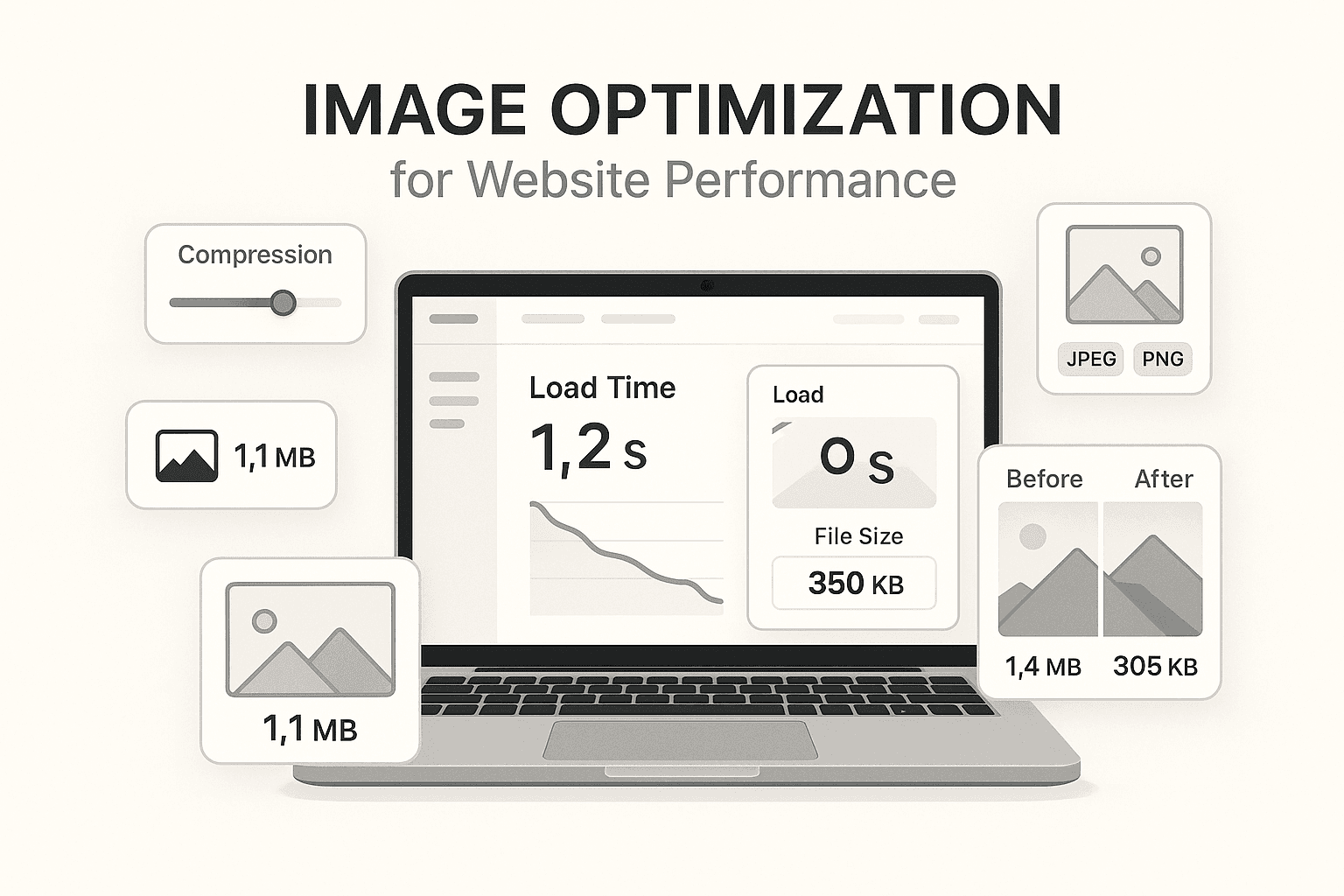
Images typically account for over 60% of a webpage's total payload. When you upload large, unoptimized images, you're essentially forcing your users to download unnecessary data. This not only slows down your site but also eats into users' data plans, which is a major concern for mobile users.
The Impact on SEO and User Experience
Search engines like Google prioritize fast-loading websites. Core Web Vitals, specifically Largest Contentful Paint (LCP), are heavily influenced by image loading speeds. A slow site doesn't just annoy users; it actively pushes your search rankings down, making it harder for potential customers to find you.
Comprehensive Strategies for Image Optimization
1. Next-Gen Formats: Beyond JPEG and PNG
While JPEG and PNG have served us well, modern formats offer superior compression without sacrificing quality.
- WebP: Developed by Google, WebP images are 26% smaller than PNGs and 25-34% smaller than JPEGs. It supports both transparency and animation, making it a versatile all-rounder.
- AVIF: The new kid on the block, AVIF offers even better compression than WebP. However, browser support is still growing, so it's best used with a fallback.
2. Intelligent Resizing and Compression
Never serve a 4000px wide image to a device that only needs 800px. Resizing images to the exact display dimensions is the most effective way to reduce file size.
- Lossy vs. Lossless: For photographs, lossy compression (like JPEG/WebP) can reduce file size by 80% with barely noticeable quality loss. For technical diagrams or logos, use lossless compression to maintain sharp edges.
3. Leveraging Responsive Images
The srcset and sizes attributes in HTML are game-changers. They allow you to define multiple versions of an image and let the browser choose the best one based on the user's screen size and resolution. This ensures mobile users download smaller images while desktop users get the full HD experience.
4. Lazy Loading for Perceived Performance
Lazy loading defers the loading of off-screen images until the user scrolls near them. This dramatically improves the 'Time to Interactive' metric, as the browser can focus on rendering the visible content first.
5. Content Delivery Networks (CDNs)
A CDN stores copies of your images on servers around the globe. When a user visits your site, images are served from the server closest to them, minimizing latency and speeding up delivery.
Actionable Checklist for Developers
- Audit your current site using tools like Google PageSpeed Insights.
- Automate image optimization in your build pipeline using tools like Sharp or ImageMagick.
- Implement lazy loading for all below-the-fold images.
- Switch to WebP or AVIF for all new content.